Tutorial Categories
Last Updated: February 10, 2026 at 19:30
The Market: The Bond Universe in Context – Understanding Government Bonds and the Yield Curve
Bonds are not isolated financial instruments—they are part of a vast and interconnected market that communicates expectations about growth, inflation, and risk. This tutorial explores government bonds, how they are priced, and how the yield curve reflects the collective wisdom of investors. You will learn to distinguish between normal, flat, and inverted curves, and understand what each shape signals about the economy. Through detailed examples and a slow, explanatory style, we reveal the mental model that the yield curve is a map of expectation, not a crystal ball predicting the future. By the end, you will see the bond market as a dynamic ecosystem and understand how government bonds set the benchmark for all fixed income investing.
Introduction: From Single Bonds to the Market’s Mind
In the previous tutorial, we focused on bond liquidity—the hidden friction involved in turning a promise of future payments into cash today. We saw that even a bond backed by a strong government or a solid business does not trade effortlessly. Prices move, buyers and sellers negotiate, and small costs quietly shape outcomes. Liquidity matters, but it only explains what happens in one transaction at a time.
Now it is time to step back and look at the bigger picture. Imagine climbing to a high viewpoint and surveying the entire bond market at once. What appears is not a collection of disconnected investments, but a structured system where prices, yields, and maturities constantly influence one another. At the center of this system sit government bonds, often treated as the market’s foundation, and above them emerges a powerful summary of market thinking: the yield curve.
In this tutorial, we are not just learning definitions or mechanics. We are learning how to listen. By understanding how government bonds are priced and how the yield curve forms, we can begin to interpret what investors collectively believe about growth, inflation, and risk. Most importantly, we will develop a guiding mental model: the yield curve is a map of expectations, not a crystal ball that predicts the future.
Part 1: Government Bonds – The “Risk-Free” Anchor (With Nuances)
Government bonds, sometimes called sovereign bonds, are issued by national governments to finance their spending. They are considered the safest corner of the bond market, especially from countries with stable economies like the United States (Treasuries) or Germany (Bunds).
Think of the financial world as a vast, choppy ocean. In this ocean, government bonds are the anchors. When a corporate bond is said to yield “3% over Treasuries,” it is priced relative to these anchors. The yield of a government bond establishes the baseline for all other debt instruments.
But it’s vital to recognize that even these “risk-free” anchors are not static. While a U.S. Treasury is essentially free from default risk, it is not free from interest rate risk or inflation risk. Its price changes daily in response to supply and demand, expectations about inflation, and shifts in the economy. Moreover, the “risk-free rate” is not a single number—it is a spectrum, ranging from overnight bills to 30-year bonds. Understanding this spectrum is essential, because the shape of yields across maturities is the yield curve, which tells us much more than any single number could.
Example:
- A 1-year Treasury bill may yield 3% today.
- A 10-year Treasury note may yield 5%.
Both are “risk-free” in terms of default, but the longer-term bond carries more exposure to inflation, economic changes, and interest rate fluctuations. The market demands a higher yield to compensate for this additional uncertainty—this is the first hint at the concept of the patience premium, which we will explore when discussing the yield curve.
Part 2: Price, Yield, and the Invisible Seesaw
At the heart of bond investing is the relationship between price and yield. A simple way to understand it is as a seesaw: when one side goes up, the other goes down.
Numeric Example:
Imagine you hold a 10-year Treasury note issued last year with a face value of $1,000 and a 4% coupon. This means you receive $40 per year. Now, the government auctions a new 10-year bond, but because investors are worried about rising inflation, the new bond offers a 5% coupon.
Your 4% bond now looks less attractive. Why would anyone pay $1,000 for $40 per year when a new bond offers $50 per year for the same risk? To sell your bond, you must lower the price until the yield for a new buyer matches the market rate of 5%. Suppose the market price drops to $923. Then $40 per year, plus the eventual $1,000 repayment at maturity, produces a yield of approximately 5% for the new buyer.
This seesaw tilts constantly in real time, across millions of bonds. Prices move to keep yields in line with market expectations, and this mechanism ensures that all yields reflect the collective market assessment of risk, time, and opportunity cost.
Part 3: The Yield Curve – The Market’s Collective Forecast
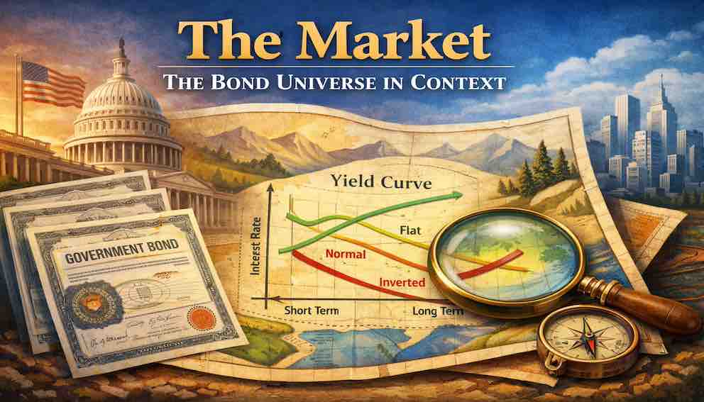
Now, let’s line up all the yields of government bonds—from the shortest bills to the longest 30-year bonds—on a graph. The horizontal axis shows maturity, the vertical axis shows yield. The resulting line is the yield curve, a visual representation of the market’s aggregated expectations.
Importantly, the yield curve is not a government decree or a prediction of the future. It is the real-time expression of market participants’ beliefs about economic growth, inflation, and interest rates.
Normal Yield Curve
In a healthy economy, the yield curve slopes upward. Long-term bonds offer higher yields than short-term bonds. This happens because the market demands compensation for tying up money longer—the patience premium.
Example:
- 2-year Treasury yields 3%
- 10-year Treasury yields 5%
The extra 2% represents the market’s collective assessment of uncertainty over the longer horizon: inflation may rise, new investment opportunities may appear, and economic conditions may change. Lending money for 10 years carries more risk than for 2 years, so the yield is higher.
Flat Yield Curve
Sometimes, short-term and long-term yields are nearly equal. This creates a flat curve. It reflects market indecision or transition. Investors may suspect that central banks will raise short-term rates to control inflation, which could slow growth. If the market doesn’t see a meaningful premium for committing long-term, yields flatten.
Example:
- 2-year Treasury yields 3.5%
- 10-year Treasury also yields 3.5%
The curve is flat, signaling uncertainty: investors are hesitant to commit money long-term because the risk/reward trade-off is unclear.
Inverted Yield Curve
An inverted yield curve occurs when short-term yields exceed long-term yields. This may seem counterintuitive: why accept lower returns for longer-term risk? The answer lies in market expectations. Investors are signaling that short-term rates are likely to fall in the future, often because the central bank will need to cut rates in response to a slowing economy.
Example:
- 2-year Treasury yields 5%
- 10-year Treasury yields 4%
This inversion historically precedes recessions, not because it causes them, but because it reflects the collective judgment of sophisticated investors about the economic outlook.
Part 4: Connecting Theory to Your Portfolio
Understanding the yield curve isn’t just academic—it has real implications for your portfolio. Let’s follow an investor, Maria, and see how different curve shapes might guide her choices.
Scenario 1: Steep, Normal Curve
- Long-term yields are much higher than short-term yields.
- Maria is saving for retirement 20 years away.
- By buying longer-term bonds, she locks in the patience premium. The market is rewarding her for committing funds over a longer horizon.
Scenario 2: Flat Curve
- Short and long-term yields are similar.
- The market is uncertain about growth or inflation.
- Maria prefers shorter-term bonds, avoiding the risk of locking in long-term commitments when higher rates may be around the corner.
Scenario 3: Inverted Curve
- Short-term yields are higher than long-term yields.
- This indicates the market expects future rate cuts and economic slowdown.
- Maria may choose a bond ladder strategy: gradually buying longer-term bonds over time to take advantage of high yields now, while managing the risk that rates might fall.
Through these scenarios, we see how the yield curve guides strategy without guaranteeing outcomes. It is a map, not a crystal ball.
Part 5: Mental Models and Takeaways
Here are some mental models to keep in mind:
Yield Curve as a Map, Not a Crystal Ball
- Shows collective expectation of growth, inflation, and interest rates.
- Does not predict exact economic events.
Price vs Yield Seesaw
- Price falls when new bonds offer higher yields; price rises when new yields fall.
- This keeps returns aligned with market conditions.
Patience Premium
- Long-term lending requires compensation for increased uncertainty.
- The extra yield is the market’s “payment for patience.”
Government Bonds as Anchors
- Serve as the baseline for risk assessment in the broader bond market.
- Not free from market fluctuations—interest rate and inflation risks remain.
Conclusion: The Map and the Terrain
We have taken a journey from single bonds to the entire market landscape. Government bonds are the bedrock, but their yields fluctuate continuously in response to new information and expectations. The yield curve is the language of this market—a map drawn by millions of investors.
By understanding the curve:
- You can interpret market expectations about growth, inflation, and rates.
- You can make informed portfolio decisions about duration, risk exposure, and bond allocation.
- You learn to see bonds not as static promises, but as dynamic instruments embedded in a larger ecosystem.
Remember: the map (the yield curve) is useful only if you navigate it thoughtfully. A smart investor reads the signals, adjusts sails, and makes decisions based on informed expectations rather than headlines. Understanding this context gives you the essential foundation for every other fixed income decision you will make.
About Swati Sharma
Lead Editor at MyEyze, Economist & Finance Research WriterSwati Sharma is an economist with a Bachelor’s degree in Economics (Honours), CIPD Level 5 certification, and an MBA, and over 18 years of experience across management consulting, investment, and technology organizations. She specializes in research-driven financial education, focusing on economics, markets, and investor behavior, with a passion for making complex financial concepts clear, accurate, and accessible to a broad audience.
Disclaimer
This article is for educational purposes only and should not be interpreted as financial advice. Readers should consult a qualified financial professional before making investment decisions. Assistance from AI-powered generative tools was taken to format and improve language flow. While we strive for accuracy, this content may contain errors or omissions and should be independently verified.